Images, icons, and media

Block images
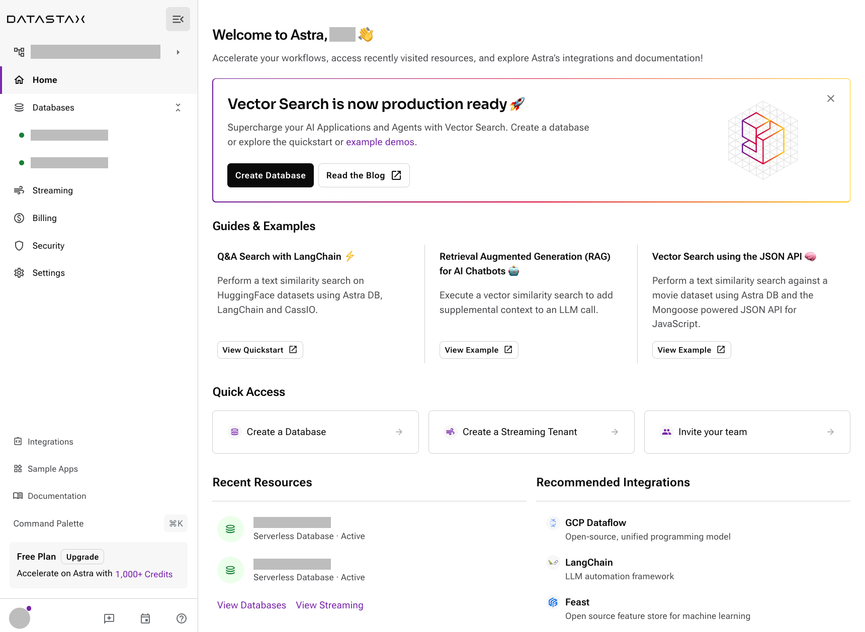
Screenshot of Astra Portal Home
Optional title

Sizing and alignment

Screenshot of Astra Portal Home
width=400,align=left
Screenshot of Astra Portal Home
width=400 width,align=right
Screenshot of Astra Portal Home
width=400 width,align=center

Float

Screenshot of Astra Portal Home In AsciiDoc, creating paragraphs is a straightforward process that does not require any special markup. A paragraph can be defined as one or more lines of consecutive text that are logically grouped together. To differentiate between paragraphs, you simply need to insert at least one blank line between them.

Multirepo SSG

In AsciiDoc, creating paragraphs is a straightforward process that does not require any special markup. A paragraph can be defined as one or more lines of consecutive text that are logically grouped together. To differentiate between paragraphs, you simply need to insert at least one blank line between them.

Light and dark mode images

You can make an image appear differently in light mode vs. dark mode.

Two separate images

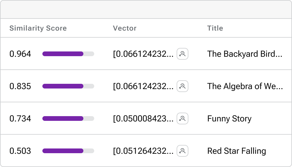
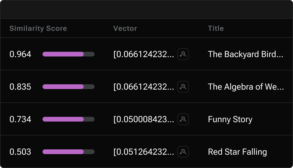
Define two images: one that looks good in light mode, and one that looks good in dark mode. Then, assign the corresponding for-light and for-dark roles to each image.

  • All non-SVG images, such as screenshot PNG files, must use this method.

  • All SVG images that do not use CSS variables must use this method.

image::vector-ui-light.png[alt="Alt text",width=400,role=for-light]
image::vector-ui-dark.png[alt="Alt text",width=400,role=for-dark]
Alt text
Alt text

SVG images with CSS variables

Use the custom svg macro to define an SVG image that uses CSS variables to support light and dark mode.

svg::ROOT:illustration.svg[alt="Alt text",width=400]
svg::ROOT:illustration.svg[Alt text,400,275]

The svg macro supports the following attributes: width, height, role, alt, ariaLabel and title.

CSS variables must use the tokens supported by the UI. For example:

<svg viewBox="0 0 300 200" fill="none">
  <path fill="var(--ds-text-primary)" d="..." />
  <path stroke="var(--ds-primary-outlined-border)" d="..." />
  <path fill="var(--ds-neutral-outlined-border)" d="..." />
</svg>

Icons

You can add icons in line with text and other elements.

Font icons

Use the icon macro to invoke font icons from Lucide Icons and Material Icons. The icon macro follows accessibility standards and provides built-in support for light and dark mode.

Lucide is the default icon set. You can invoke a Lucide icon with either icon:ICON-NAME[] or icon:lucide:ICON-NAME[]:

Lucide
Click icon:settings[name="Settings"] to configure your settings. (1)

icon:moon[alt="That's no moon"] (2)

icon:sun[ariaLabel="Day time"] (3)

icon:atom[title="Split the atom"] (4)

icon:star[role="text-failure text-2xl"] (5)

icon:star[size="60"] or icon:star[60] (6)
1 Use the name attribute to add visible text to the right of the icon.
2 Use the alt attribute to define an aria-label for the icon. The text is invisible but is read by screen readers.

Do not use alt if name or ariaLabel is already defined.

3 Identical to the alt attribute.

Do not use ariaLabel if name or alt is already defined.

4 The title attribute provides a visible tooltip on hover for pointer devices (not visible on touch devices).

The title attribute is not read by most screen readers, and therefore its use is discouraged. If used, make sure to also define alt or ariaLabel to ensure accessibility.

5 Use the role attribute to apply Tailwind CSS classes to the icon.
6 Use the size attribute to define the size of the icon in pixels. Alternatively, you can define the size in the first positional attribute (shorthand for the size attribute).

You can invoke a Material icon with icon:material:icon-name[]. All of the same attributes apply:

Material
Click icon:material:settings[name="Settings"] to configure your settings.

icon:material:air[alt="Whooosh"]

icon:material:volume-up[title="Turn it up"]

icon:material:directions-boat[role="text-warning text-2xl"]

icon:material:thumb-up[size=60]
Legacy font icon methods

These methods were previously used to invoke font icons and should no longer be used.

Block or inline span with material-icons role

Use the custom role material-icons on block or inline content. The content must be a material icon name in lower case. If there are spaces in the name, use underscores instead.

This method supports light and dark mode automatically.

block style
[.material-icons]
thumb_up
Inline style using a text span
Inline material icons [.material-icons]#thumb_up#

thumb_up rocket_launch

HTML passthrough

Use block or inline HTML passthrough to create an icon element <i class="icon-ICON-NAME"></i>.

This method supports light and dark mode automatically.

Block passthrough
++++
<i class="icon-boom-box"></i>
++++
Inline passthrough
Inline lucide icons +++<i class="icon-boom-box"></i>+++

SVG icons

Use the inline svg macro to display a local SVG file as an icon.

svg:ROOT:ui/icons/vector.svg[role="icon"] (1)

Click svg:ROOT:ui/icons/vector.svg[role="icon"] *Search* to run a similarity search based on the selected document's vector.

svg:ROOT:ui/icons/vector.svg[role="icon text-2xl"] (2)

svg:ROOT:ui/icons/vector.svg[width="60",height="60"] (3)
1 The icon role adds CSS styles that set the width and height of the image to an appropriate size relative to the font size of the parent element. Without the icon role, the image displays as large as possible unless a width and height is set in the SVG file itself (not recommended).
2 Manually control the icon size using Tailwind text-* utilities, such as text-2xl.
3 Manually control the icon size using the width and height attributes.

Unlike font icons, the svg macro doesn’t automatically support light and dark mode. You’ll need to add supported CSS variables to the SVG file for the icon to display properly in light and dark mode.

If the svg is a simple, single-color icon, you can use currentColor for all fill and stroke colors. This will automatically inherit the text color of the parent element or the body text color which is black or white depending on the theme.

Inline images

Avoid using inline images. Use Icons instead.

Click play circle FILL0 wght400 GRAD0 opsz24 to get the party started.

Click pause circle FILL0 wght400 GRAD0 opsz24 when you need a break.

Video

YouTube (unconstrained; default alignment)
Vimeo (640x360; default alignment)

Audio

Take a zen moment

Was this helpful?

Give Feedback

How can we improve the documentation?

© 2024 DataStax | Privacy policy | Terms of use

Apache, Apache Cassandra, Cassandra, Apache Tomcat, Tomcat, Apache Lucene, Apache Solr, Apache Hadoop, Hadoop, Apache Pulsar, Pulsar, Apache Spark, Spark, Apache TinkerPop, TinkerPop, Apache Kafka and Kafka are either registered trademarks or trademarks of the Apache Software Foundation or its subsidiaries in Canada, the United States and/or other countries. Kubernetes is the registered trademark of the Linux Foundation.

General Inquiries: +1 (650) 389-6000, info@datastax.com